


Latest News

How to make your own Meta Quest 3 3D printed accessories on Creality’s K1C 3D Printer
We have covered various aspects of 3D printing here at Readwrite over the last few months, looking mainly at how to use different 3D printers for different projects to create the ultimate games room. We have big plans for what we are going to do over the coming months, but this time around we are…


Artificial Intelligence


Cryptocurrency

Slothana Meme Coin Presale Ends Monday, Airdrop On Solana In 20 Hours
Slothana (SLOTH), a Solana-based meme coin, has raised over $15 million in its presale phase, and is set to airdrop tokens over the Solana blockchain on Monday, April 29. The Slothana.com countdown timer now displays just over 20 hours until...
Petar JovanovićEditor


Entertainment
Technology
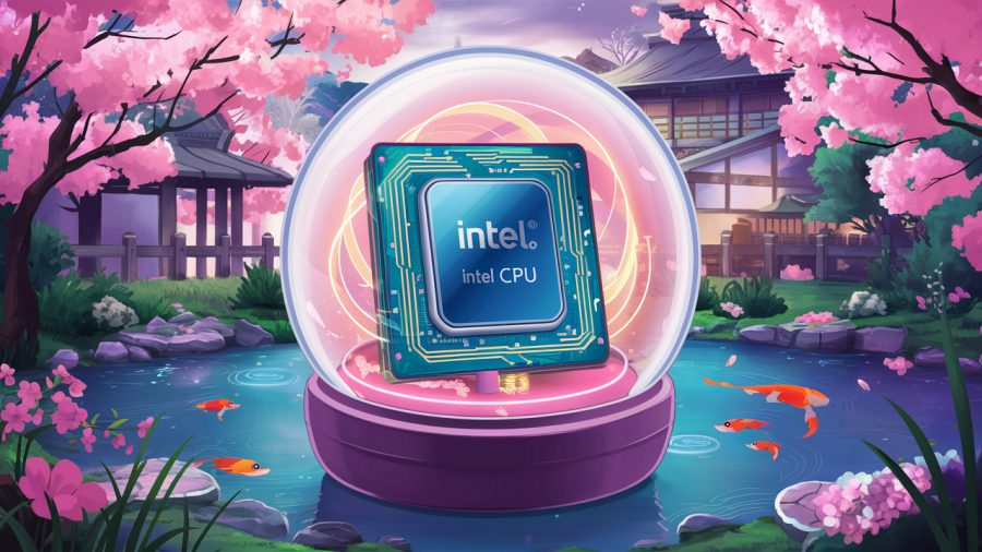
Here’s one Japanese store’s enterprising method of selling broken Intel chips — for less than $5
Would you like to get your hands on an Intel CPU for less than 5% of its full cost? Of course, you would. Too good to be true? Almost. This story centers on an enterprising electronics store that is selling chips...
Graeme HannaTech Journalist


AR / VR

Smartphones


We are an award-winning tech website where trusted research and expert knowledge come together
Since 2003, we have helped millions of people learn how to solve tech problems large and small. We work with credentialed experts, a team of trained researchers, and a devoted community to create the most reliable, comprehensive and delightful content on the Internet.
1M
Monthly Readers1.4M
Followers on X35K
ArticlesTrusted
for 20 years5000+
research hrs100+
EXPERT CONTRIBUTORS


Popular Topics


Get the biggest tech headlines of the day delivered to your inbox

Explore the latest in tech with our Tech News. We cut through the noise for concise, relevant updates, keeping you informed about the rapidly evolving tech landscape with curated content that separates signal from noise.

Explore tech impact in In-Depth Stories. Narrative data journalism offers comprehensive analyses, revealing stories behind data. Understand industry trends for a deeper perspective on tech's intricate relationships with society.

Empower decisions with Expert Reviews, merging industry expertise and insightful analysis. Delve into tech intricacies, get the best deals, and stay ahead with our trustworthy guide to navigating the ever-changing tech market.