


Latest News
Stellar Blade reviews roundup: Critics love the gameplay and action, but not the story
Stellar Blade, the debut work from South Korea-based Shift Up, launches on April 26. The highly anticipated release is preceded by a wave of mostly positive reviews that began publishing April 24. Though most say this is a good game, few find it to be a breakthrough or transformative work, despite the pre-release clamor from…


Artificial Intelligence

Cryptocurrency

Bitcoin whales drive price above $67,000 resistance
New research suggests that Bitcoin whales have been accumulating the cryptocurrency, keeping the price above a crucial resistance level until April 24, 2024. According to data from TradingView, Bitcoin's price witnessed a surge to $67,000 following the latest daily close,...
Radek ZielinskiTech Journalist


Entertainment

Technology

Stellar Blade reviews roundup: Critics love the gameplay and action, but not the story
Stellar Blade, the debut work from South Korea-based Shift Up, launches on April 26. The highly anticipated release is preceded by a wave of mostly positive reviews that began publishing April 24. Though most say this is a good game,...
Owen GoodGaming Editor (US)

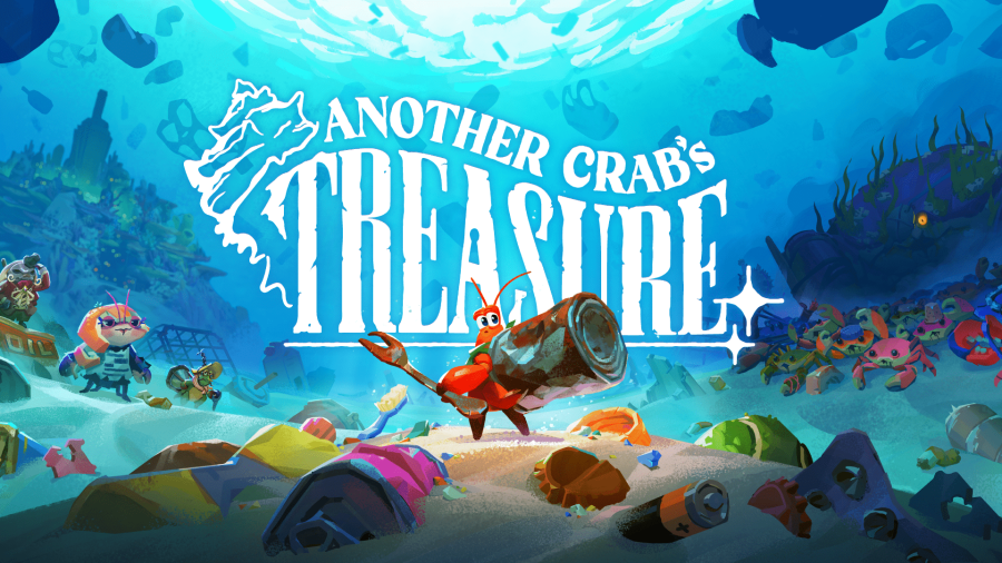
Review: Another Crab’s Treasure
Ali ReesTech journalist

AR / VR

Smartphones


We are an award-winning tech website where trusted research and expert knowledge come together
Since 2003, we have helped millions of people learn how to solve tech problems large and small. We work with credentialed experts, a team of trained researchers, and a devoted community to create the most reliable, comprehensive and delightful content on the Internet.
1M
Monthly Readers1.4M
Followers on X35K
ArticlesTrusted
for 20 years5000+
research hrs100+
EXPERT CONTRIBUTORSPopular Topics
Get the biggest tech headlines of the day delivered to your inbox
Explore the latest in tech with our Tech News. We cut through the noise for concise, relevant updates, keeping you informed about the rapidly evolving tech landscape with curated content that separates signal from noise.
Explore tech impact in In-Depth Stories. Narrative data journalism offers comprehensive analyses, revealing stories behind data. Understand industry trends for a deeper perspective on tech's intricate relationships with society.
Empower decisions with Expert Reviews, merging industry expertise and insightful analysis. Delve into tech intricacies, get the best deals, and stay ahead with our trustworthy guide to navigating the ever-changing tech market.