


Latest News

Star Wars: The Clone Wars leaked listing hints at PS2 emulation coming to PS5
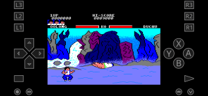
A PlayStation Store listing for 2002’s Star Wars: The Clone Wars appears to signal that more PlayStation 2-emulated games will be coming to PlayStation 5 (and PS4) after a rather notable absence of classics. Gematsu noticed the store listing, which gave a release date of June 11. That could mean Star Wars: The Clone Wars…


Most Popular Stories
- US inches closer to a TikTok ban
- Judas – Release date, trailers, platforms, and everything we know
- Minecraft player has X-Files moment as they report an in-game UFO sighting
- EA revealed how much Apex Legends has made and…it’s a lot
- Dogecoin Maxi DonAlt Posts $1 Price Prediction – Risk On For Meme Coins?
Artificial Intelligence

Two US states seize the initiative to regulate AI
Graeme HannaTech Journalist

Cryptocurrency

Solana Meme Coin Slothana Set To Host Free Poker Event on CoinPoker
One of the best performing Solana meme coins this month, Slothana, has partnered with the crypto poker platform CoinPoker for a tournament on May 19th, with a free entry for Slothana holders. Let's dig into the details of this new...
Petar JovanovićEditor

El Salvador’s Bitcoin holdings reach $373M
Radek ZielinskiTech Journalist


Entertainment

Technology

EU regulators to probe Meta over child safety concerns
European Union (EU) regulators have confirmed another investigation against Meta over concerns the social media giant has potentially breached online content rules on child safety. As part of the Digital Services Act (DSA) which took effect last year in the...
Graeme HannaTech Journalist


AR / VR

Smartphones

We are an award-winning tech website where trusted research and expert knowledge come together
Since 2003, we have helped millions of people learn how to solve tech problems large and small. We work with credentialed experts, a team of trained researchers, and a devoted community to create the most reliable, comprehensive and delightful content on the Internet.
1M
Monthly Readers1.4M
Followers on X35K
ArticlesTrusted
for 20 years5000+
research hrs100+
EXPERT CONTRIBUTORSPopular Topics
Get the biggest tech headlines of the day delivered to your inbox
Explore the latest in tech with our Tech News. We cut through the noise for concise, relevant updates, keeping you informed about the rapidly evolving tech landscape with curated content that separates signal from noise.
Explore tech impact in In-Depth Stories. Narrative data journalism offers comprehensive analyses, revealing stories behind data. Understand industry trends for a deeper perspective on tech's intricate relationships with society.
Empower decisions with Expert Reviews, merging industry expertise and insightful analysis. Delve into tech intricacies, get the best deals, and stay ahead with our trustworthy guide to navigating the ever-changing tech market.