


Latest News

Call of Duty: MW3 Season 3 Reloaded’s mid-season content update arrives May 1
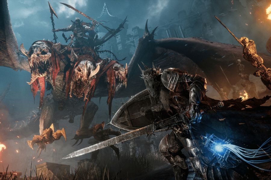
Call of Duty: MW3 Season 3 Reloaded will begin May 1, bringing new maps, weapons, and zombies content to fans of Activision's cornerstone shooter. The mid-season drop comes just a month after Season 3 kicked off, which we covered in all its Snoop Dogg glory. Call of Duty: MW3 Season 3 Reloaded Drop May 1…


Artificial Intelligence

Drake faces legal action over AI diss track with Tupac
Sam SheddenExecutive Editor


Cryptocurrency

BlackRock’s Bitcoin ETF sees first day without inflows
BlackRock's iShares Bitcoin Trust (IBIT) has experienced its first day without any inflows since the introduction of Bitcoin (BTC) exchange-traded funds (ETFs) in the United States in January, Farside data shows. Since its launch on January 11, IBIT has consistently...
Radek ZielinskiTech Journalist


Entertainment

Technology

Launch date set for Squad Busters, Supercell’s first game in more than 5 years
Supercell has announced a launch date of May 29 for Squad Busters, representing the developer's first major release in over five years. The Finnish studio responsible for Clash of Clans, Brawl Stars, and Clash Royale says it takes a quality...
Graeme HannaTech Journalist

Meta sounds profit warning as AI spending soars
Graeme HannaTech Journalist


AR / VR

Smartphones


We are an award-winning tech website where trusted research and expert knowledge come together
Since 2003, we have helped millions of people learn how to solve tech problems large and small. We work with credentialed experts, a team of trained researchers, and a devoted community to create the most reliable, comprehensive and delightful content on the Internet.
1M
Monthly Readers1.4M
Followers on X35K
ArticlesTrusted
for 20 years5000+
research hrs100+
EXPERT CONTRIBUTORS


Popular Topics


Get the biggest tech headlines of the day delivered to your inbox

Explore the latest in tech with our Tech News. We cut through the noise for concise, relevant updates, keeping you informed about the rapidly evolving tech landscape with curated content that separates signal from noise.

Explore tech impact in In-Depth Stories. Narrative data journalism offers comprehensive analyses, revealing stories behind data. Understand industry trends for a deeper perspective on tech's intricate relationships with society.

Empower decisions with Expert Reviews, merging industry expertise and insightful analysis. Delve into tech intricacies, get the best deals, and stay ahead with our trustworthy guide to navigating the ever-changing tech market.