


Latest News
World’s biggest chipmaker TSMC set to increase prices
Taiwan Semiconductor Manufacturing Company (TSMC) has indicated it will increase the cost of chips made outside of Taiwan as the company reacts to pressures on its profitability. The world’s largest maker of advanced chips for customers like Apple Inc. and Nvidia Corp., has sounded its price warning as government and big tech firms are cognizant of…


Artificial Intelligence


Cryptocurrency

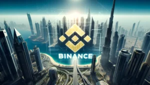
Binance obtains virtual asset service provider license in Dubai
Binance Holdings Ltd., the world's largest digital asset exchange, has obtained a Virtual Asset Service Provider (VASP) license in Dubai after co-founder Changpeng "CZ" Zhao agreed to give up his voting control in the local entity, according to people familiar...
Radek ZielinskiTech Journalist


GBTC Bitcoin ETF holdings drop before halving
Radek ZielinskiTech Journalist

Entertainment


Fallout franchise is dominating Europe’s games chart
Sam SheddenExecutive Editor
Technology

World’s biggest chipmaker TSMC set to increase prices
Taiwan Semiconductor Manufacturing Company (TSMC) has indicated it will increase the cost of chips made outside of Taiwan as the company reacts to pressures on its profitability. The world’s largest maker of advanced chips for customers like Apple Inc. and Nvidia...
Graeme HannaTech Journalist


TikTok could still be banned in the US
Graeme HannaTech Journalist
AR / VR
Smartphones


We are an award-winning tech website where trusted research and expert knowledge come together
Since 2003, we have helped millions of people learn how to solve tech problems large and small. We work with credentialed experts, a team of trained researchers, and a devoted community to create the most reliable, comprehensive and delightful content on the Internet.
1M
Monthly Readers1.4M
Followers on X35K
ArticlesTrusted
for 20 years5000+
research hrs100+
EXPERT CONTRIBUTORSPopular Topics
Get the biggest tech headlines of the day delivered to your inbox
Explore the latest in tech with our Tech News. We cut through the noise for concise, relevant updates, keeping you informed about the rapidly evolving tech landscape with curated content that separates signal from noise.
Explore tech impact in In-Depth Stories. Narrative data journalism offers comprehensive analyses, revealing stories behind data. Understand industry trends for a deeper perspective on tech's intricate relationships with society.
Empower decisions with Expert Reviews, merging industry expertise and insightful analysis. Delve into tech intricacies, get the best deals, and stay ahead with our trustworthy guide to navigating the ever-changing tech market.